Project Goal.
A.SHIMUS required a clear, creative, and strategic foundation to reshape and elevate its identity. The objective of this first project was to refine the existing brand and establish a cohesive creative direction that could guide all future decisions across branding, e-commerce, and visual storytelling.
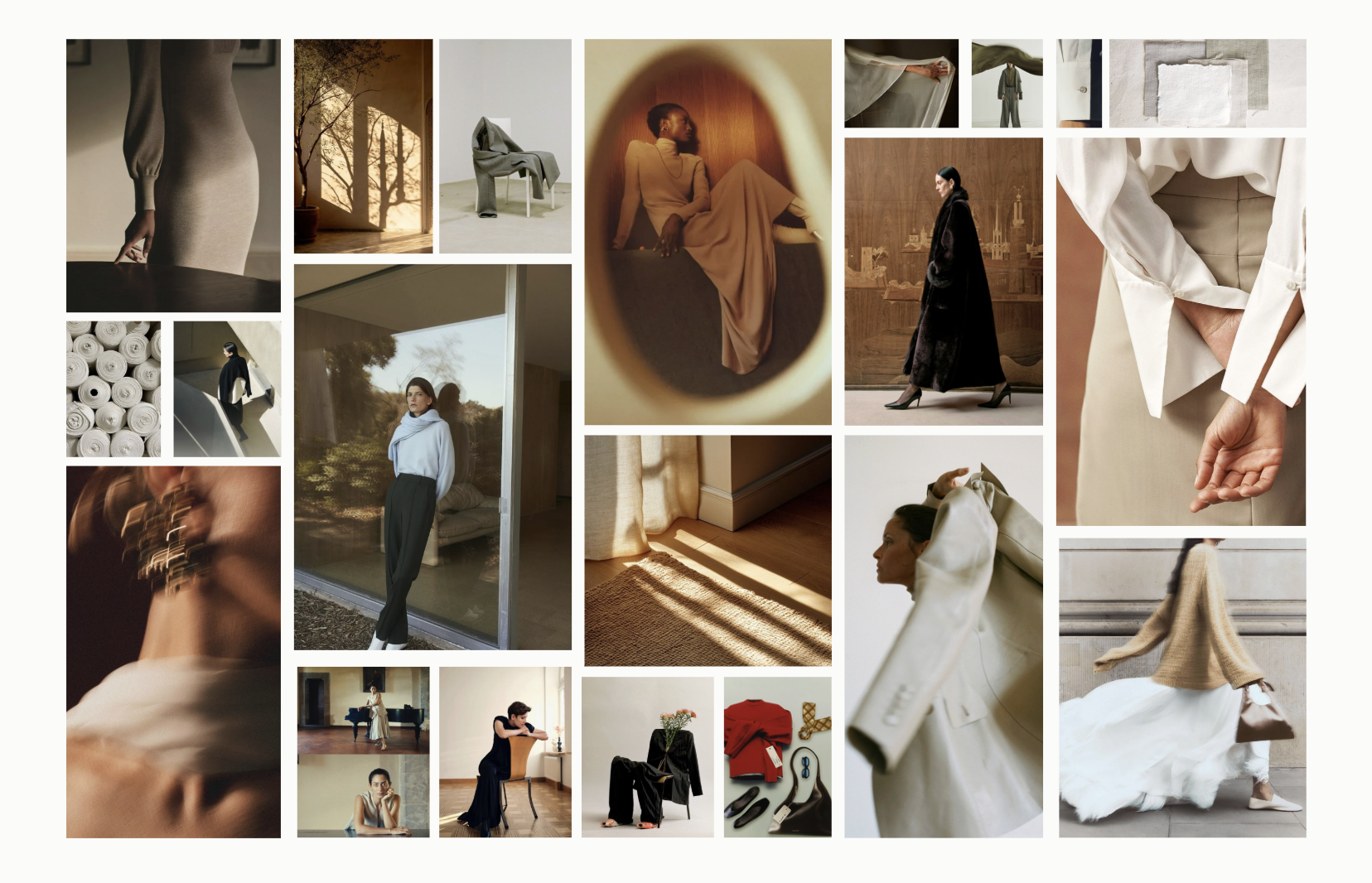
The work focused on realigning the brand through a combination of creative exploration and strategic analysis. This included refining the visual language, clarifying the brand vision, and strengthening its positioning to feel more intentional and elevated. The outcome was a clear directional framework designed to ensure consistency, clarity, and scalability across all touchpoints as the brand evolves.
Branding & Social Strategy
The branding work for A.SHIMUS focused on elevating the brand from a basic commercial aesthetic to a more meaningful and intentional visual identity. The goal was to create a system that felt refined confident and contemporary while speaking directly to successful women in New York City.
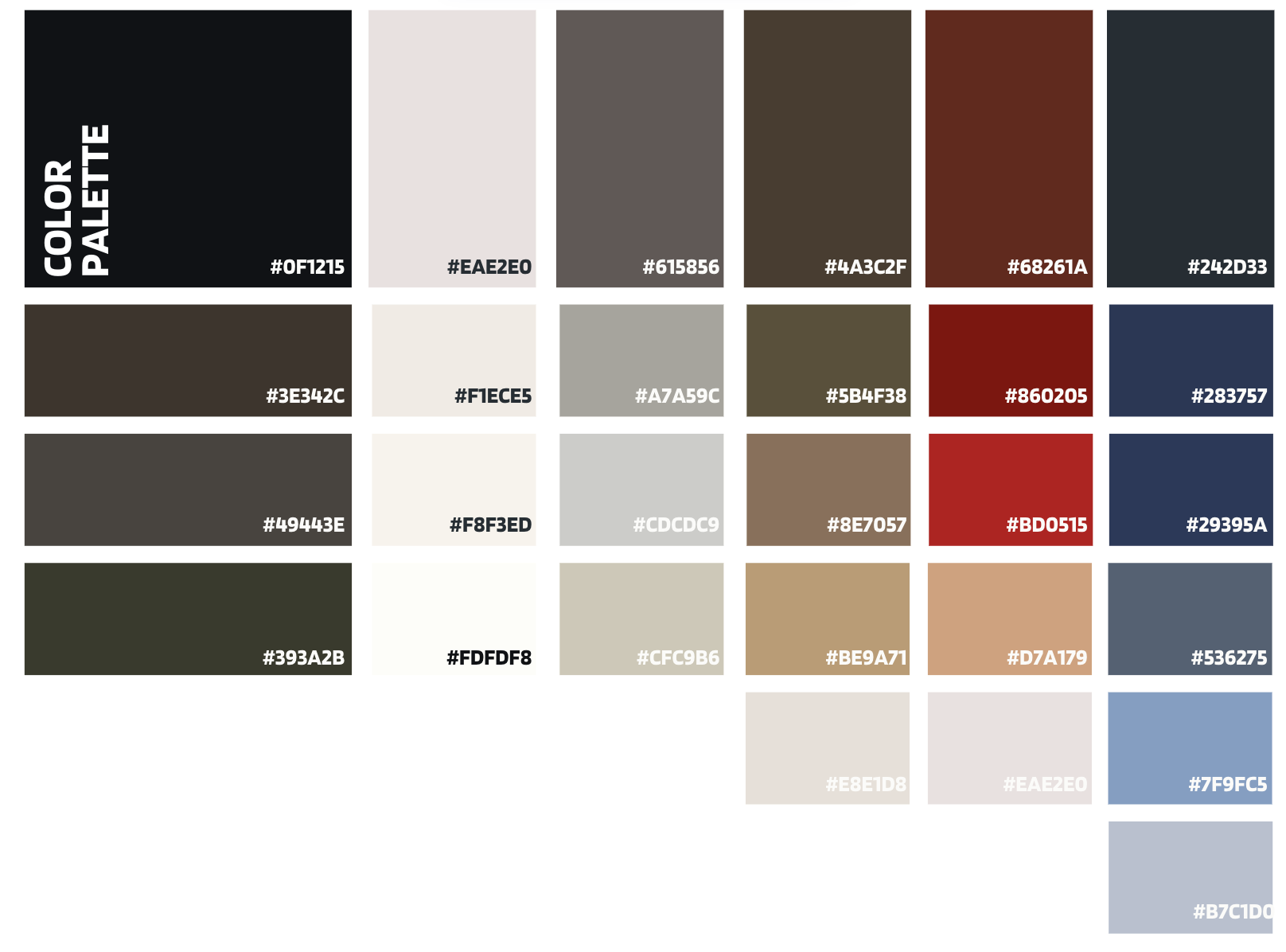
Color strategy played a key role in this shift. The palette was refined to move away from overly trend driven tones in favor of a more restrained and timeless selection. Each color was chosen to support versatility and longevity while reinforcing a sense of confidence sophistication and ease. The result is a palette that feels strong but understated allowing the product and the woman wearing it to remain at the center.
Typography was approached with the same level of intention. The type system was reviewed and refined to strike a balance between structure and softness. The chosen fonts convey clarity authority and elegance without feeling rigid or overly corporate. This ensures the brand can communicate confidently across ecommerce editorial content and marketing while maintaining a consistent and elevated tone.
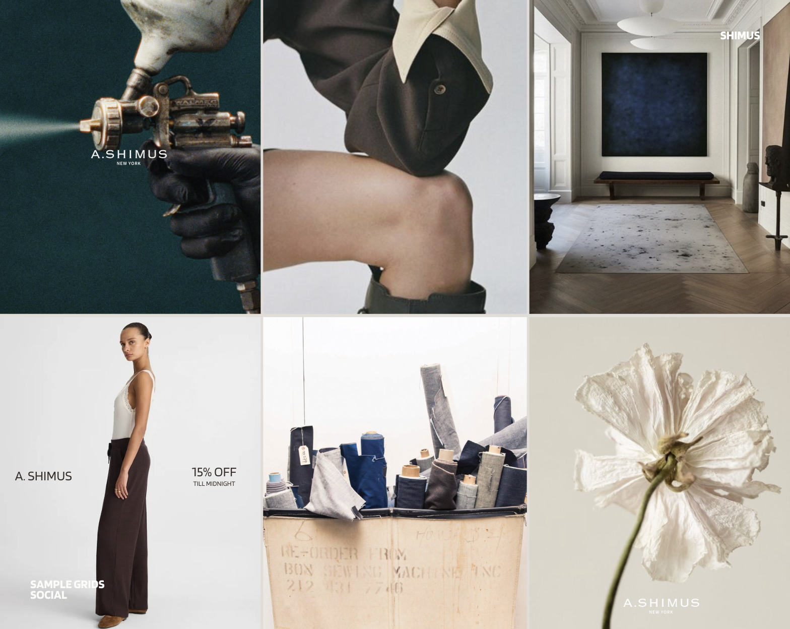
Instagram and digital presence were treated as an extension of the brand rather than a marketing afterthought. The visual direction was refined to feel more curated and editorial moving away from generic commercial imagery. Composition color usage and pacing were designed to create a recognizable and cohesive feed that reflects the lifestyle mindset and aesthetic sensibilities of successful NYC women. The result is a brand presence that feels aspirational but grounded confident without being loud and distinctly intentional.
Creative Direction - FW/SS26 Shoot.
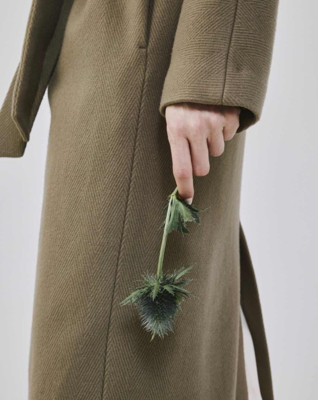
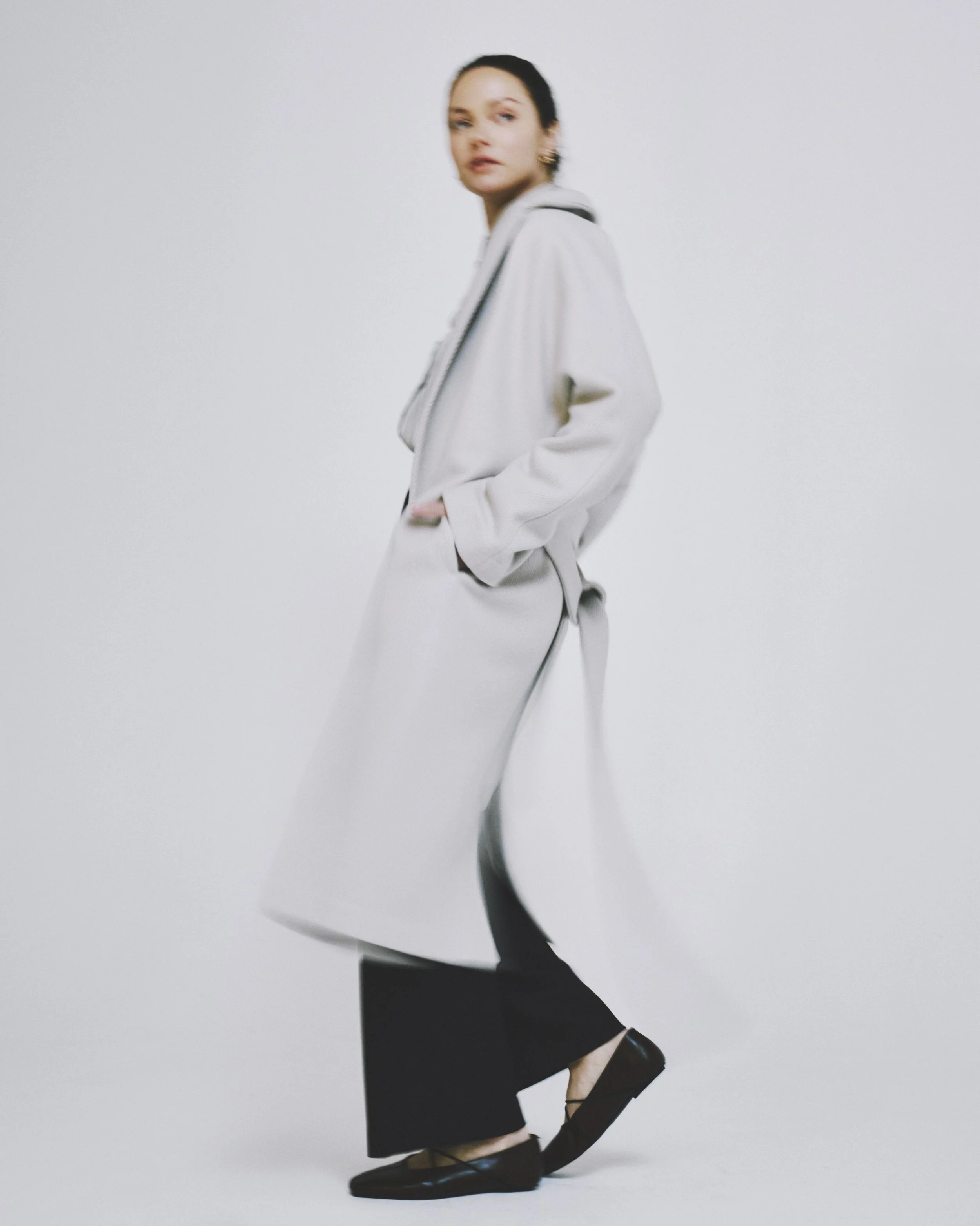
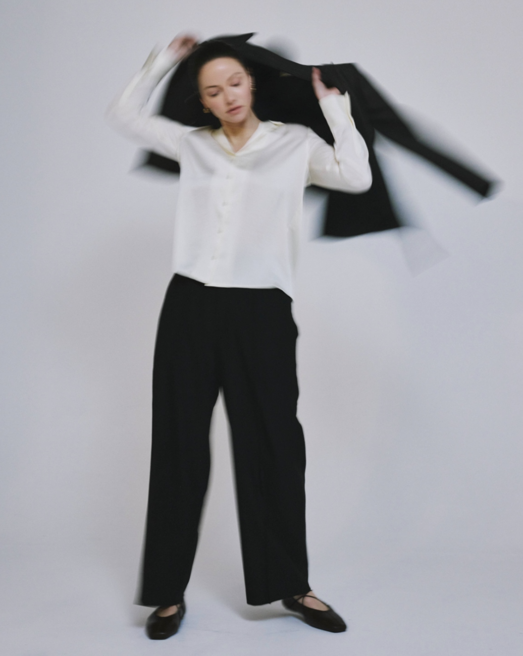
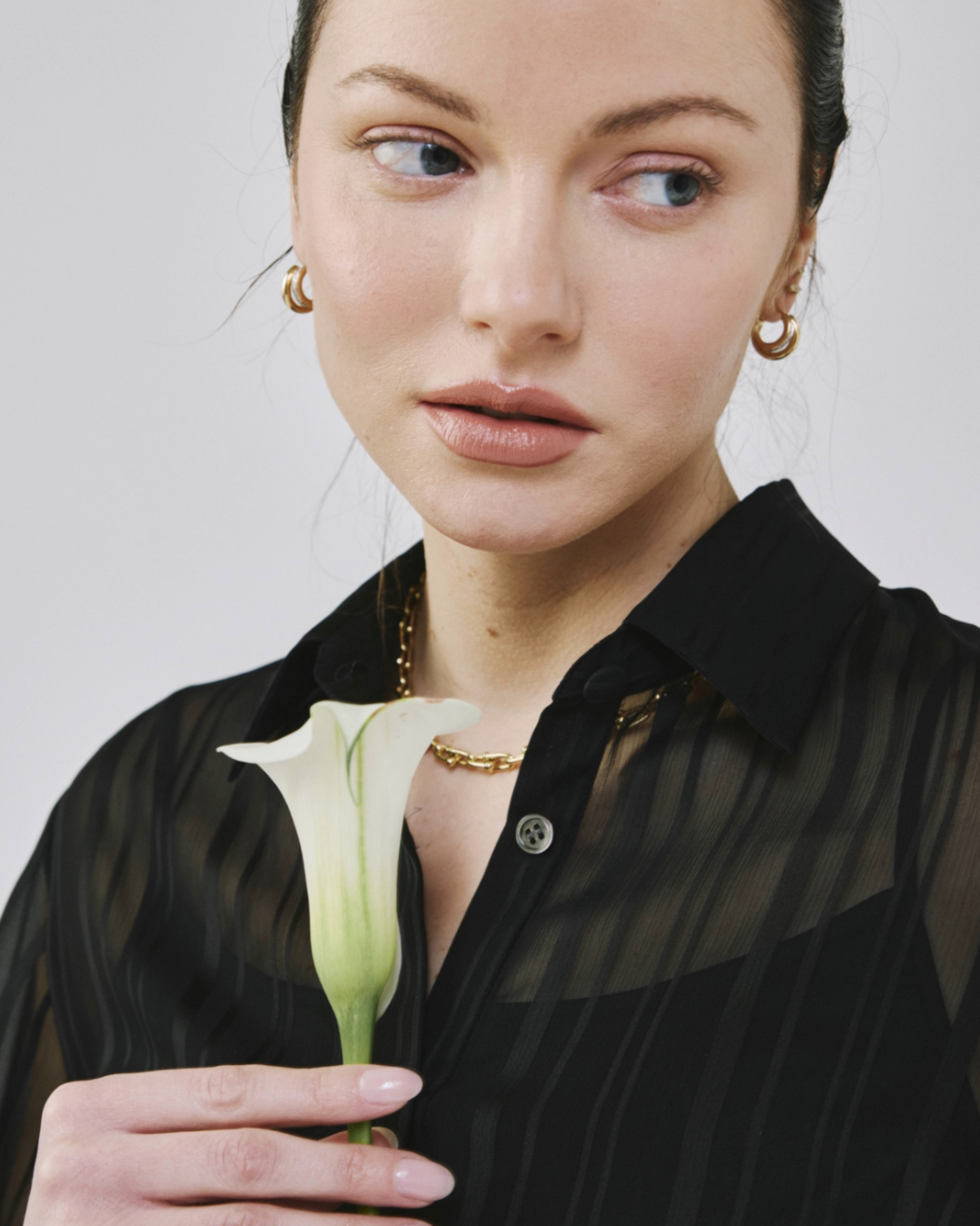
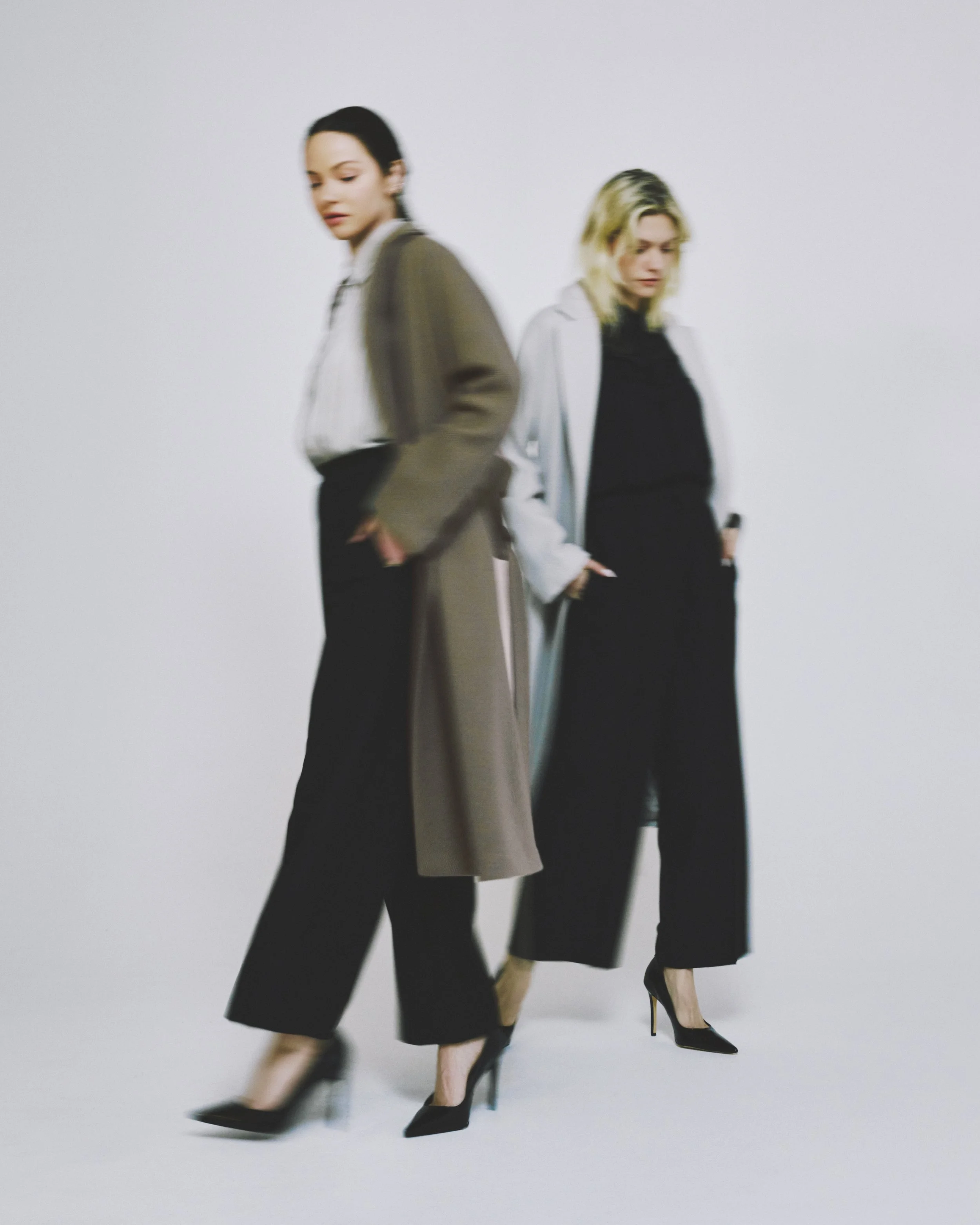
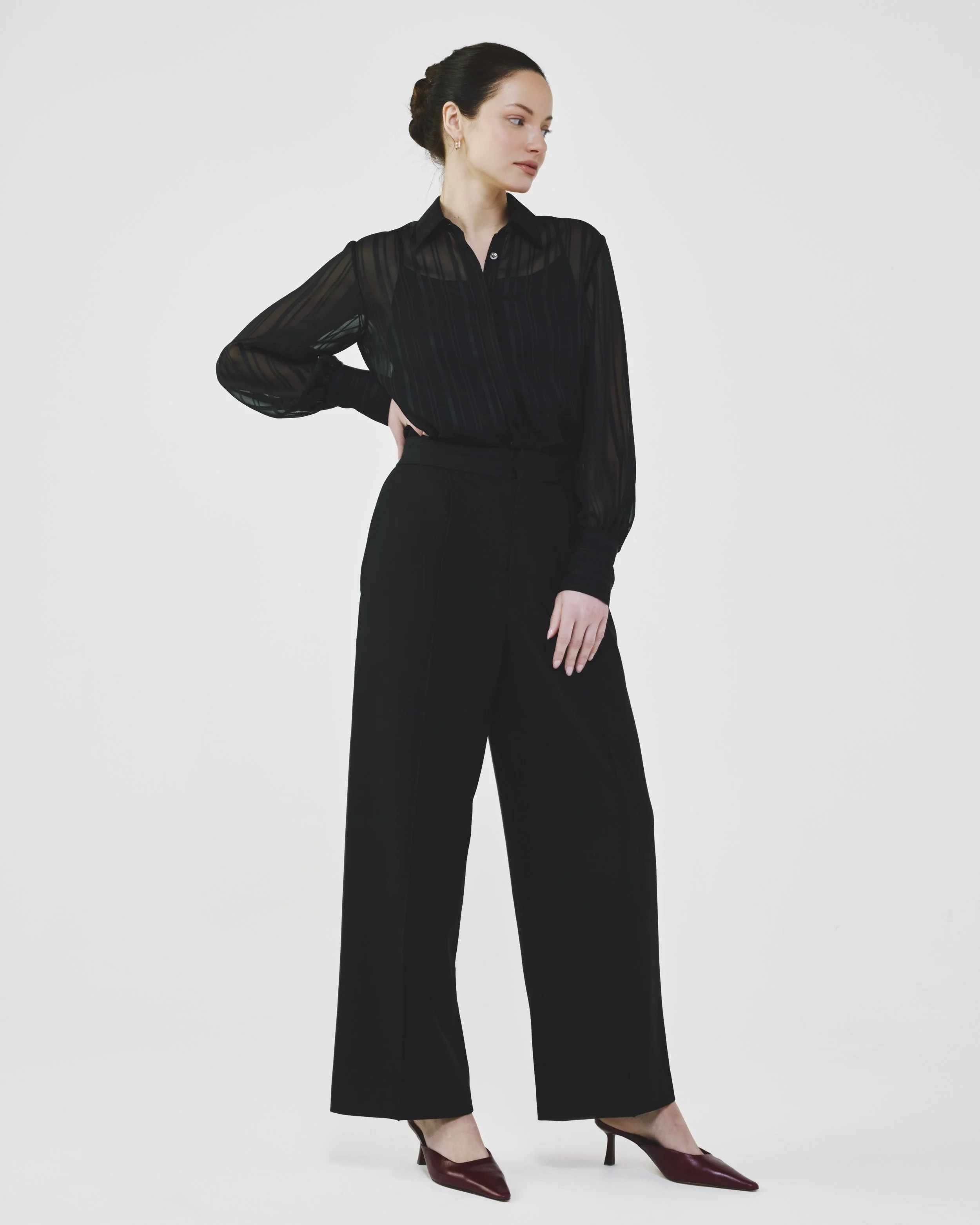
The photoshoot was designed to translate the refined brand direction into a clear and cohesive visual language. The overall theme was defined to reflect confidence, restraint, and modern femininity, capturing a sense of ease and authority that resonates with successful women in New York City.
The concept balanced structure and movement, allowing the garments to feel lived in rather than staged. This approach ensured the imagery felt elevated and intentional without becoming overly stylized or distant. The goal was to create visuals that felt authentic and confident while remaining timeless.
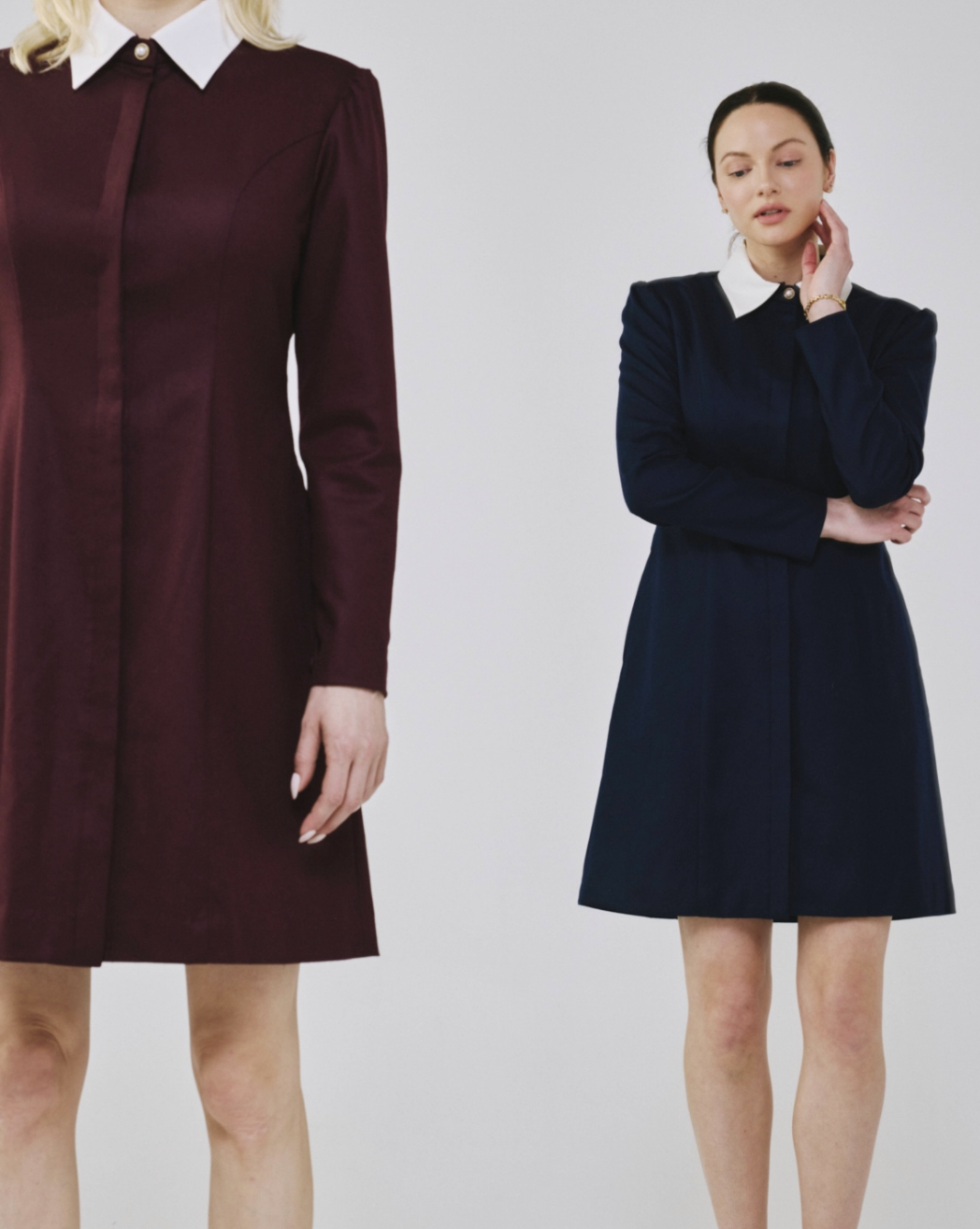
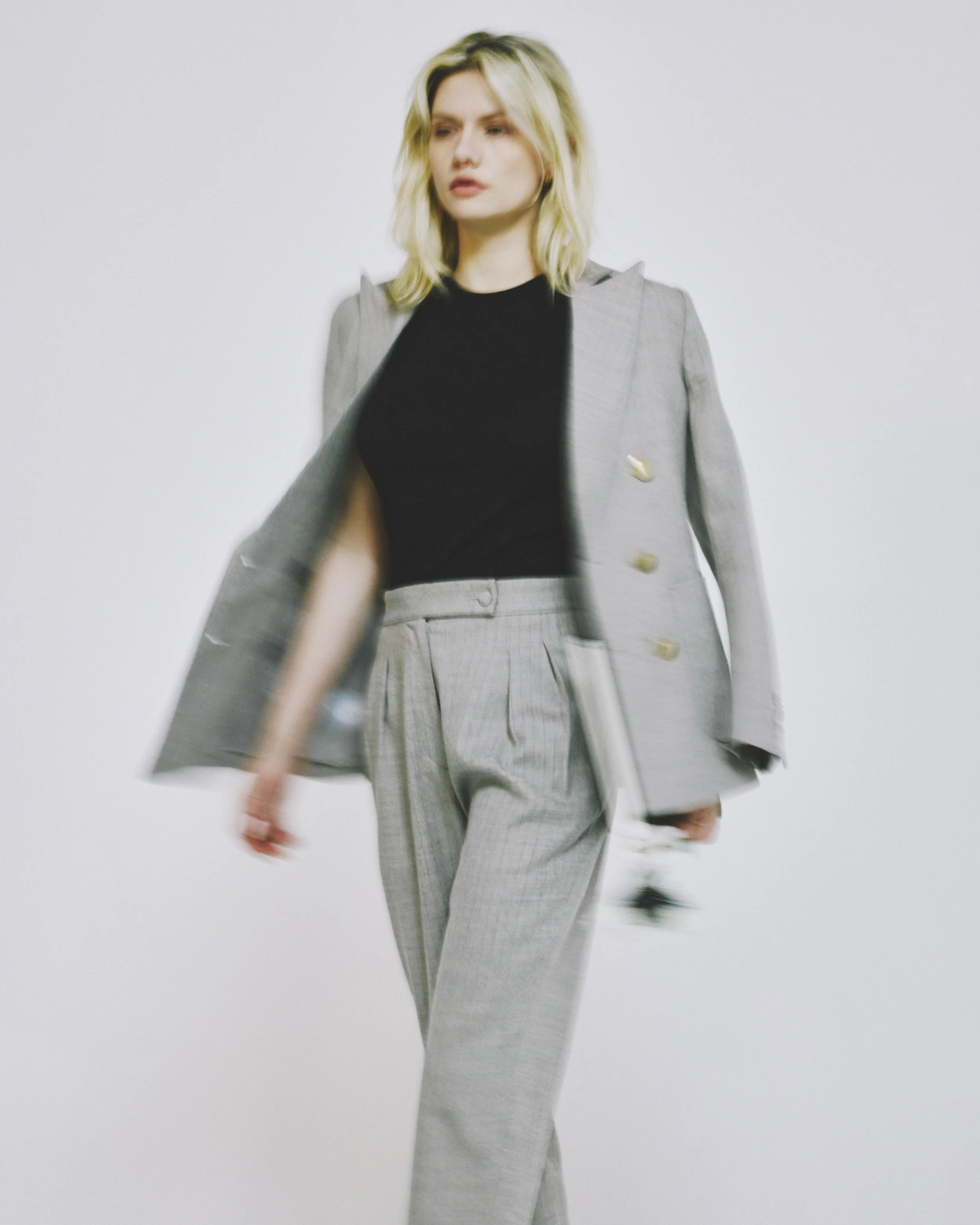
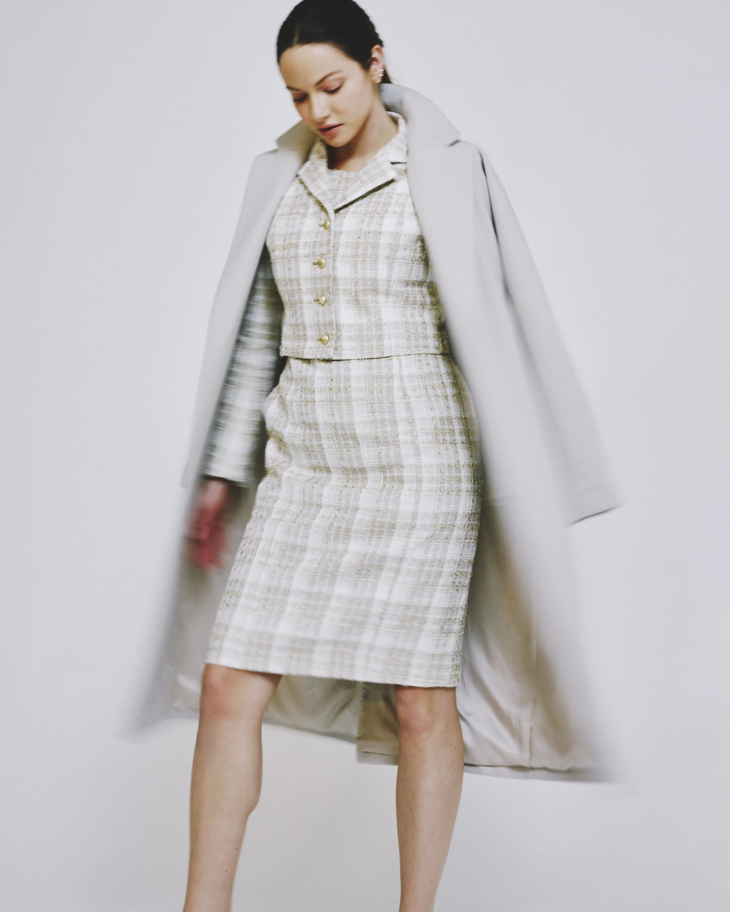
For e-commerce, the focus was on clarity and consistency. Poses were carefully defined to highlight fit proportions and key construction details while maintaining a natural and confident posture. This ensured the products were presented in a way that felt both informative and aligned with the brand’s elevated positioning.
In parallel, editorial imagery was developed for the lookbook to expand the narrative and reinforce the brand world. These shots explored more expressive poses and compositions while remaining grounded in the same visual language. The result was a cohesive set of assets that worked seamlessly across e-commerce marketing and editorial touchpoints, creating a strong and recognizable visual identity.